Color customizable and WCAG 2.2 AA compliant Design System for a Healthcare Patient Portal.
UI Design
Accessibility
Healthcare
Company:
Modmed
Role:
UX/UI Designer
Date:
2025-2026
Duration:
3 months









No design system, no accessibility
The Challenge
Build an accessible, responsive, yet color customizable design system.
After an extensive WCAG 2.2 Audit, 250 individual issues were found, which originated from:
gGastro's portal lack of design system. Components were pulled from different frameworks with no shared foundations. Because practices could customize portal colors, most components inherited whatever palette the client chose.
No component had been built with accessibility in mind - focus order, aria-labels, meaning.
Fixing an issue on one screen didn't fix it anywhere else. Without a shared component layer, every remediation was a one-off patch.
What was built
Typography Family, Custom and System color palettes, and 15 reusable components.
Customer Facing and System Color Palettes
Before:
Practice color customization was the root cause of most contrast failures: buttons, links, headings and navigation took these colors. This created evident contrast issues for our users.
After:
A curated customer-facing palette where every foreground and background combination was pre-validated to pass WCAG AA contrast requirements was created. Practices keep their ability to personalize; the system ensures none of their choices can produce an inaccessible result.
Alongside it, a system color palette was defined — standard across all practices, consistent with the broader ModMed product family, and accessible by default. Brand consistency and compliance in the same token set.


Custom and System color palettes
Buttons
Before:
The portal's primary button and links inherited the practice's custom color , creating meaningless color significance and color contrast issues.
After:
Fix standardized buttons and links to a consistent system color palette, aligned with other ModMed products, regardless of practice customization. Color no longer determines what a button o link means — its label, hierarchy and position do.


After and before buttons
Password Input Field
Before:
The strength indicator didn't pass contrast requirements, gave no visibility into what the requirements actually were, and offered no way to see what was being typed and instructions were not semantically tied to the input.
After:
The new field validates requirements in real time, marks each one met or unmet as the user types, and includes a show/hide focusable toggle for the password characters. Description is related by aria-labelledby to the input.
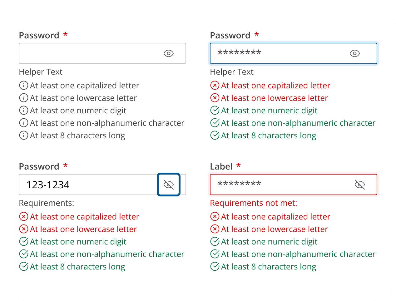
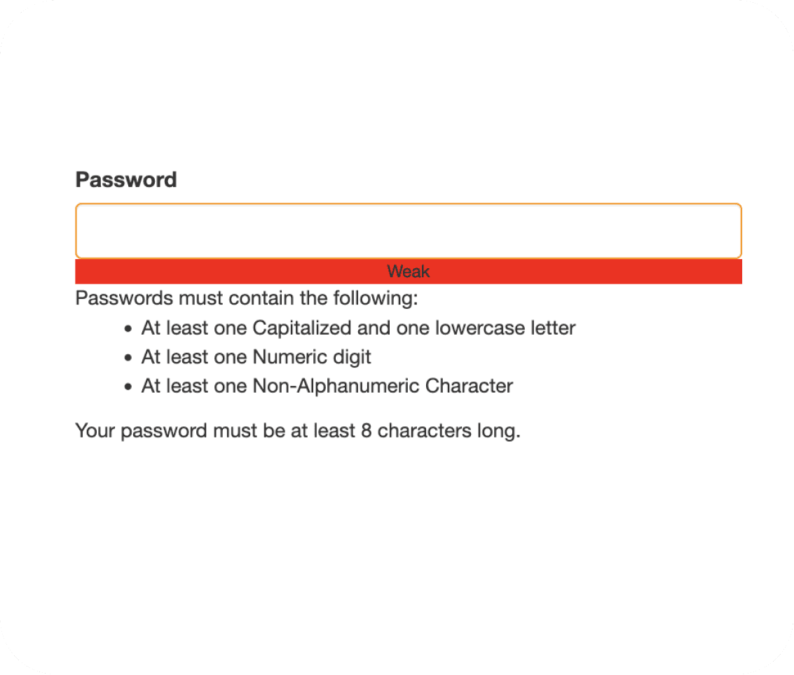
Password input after and before
Typographic Family Hierarchy
Before:
There was no Heading and text hierarchy properly defined and used.
After:
Heading hierarchy and body text standards were defined and documented for the first time. Correct heading structure is foundational for screen reader navigation — without it, assistive technology users can't scan or jump between sections. The standards established consistent sizing, weight, and hierarchy so semantic structure and visual structure match.

Typographic Family

Handoff
Figma Component Library
Figma Text Styles
Figma Color Variants
Accessibility documentation for components: states, html, aria attributes, interaction behavior, validation behavior, and screen reader testing instructions.
Impact
A new reusable library has been created for developers to use going forward, ensuring the continuity of accessibility for the portal, even when no designer is involved.
100%
Of contrast related issues found in audit remediated.
70%
Of 250 WCAG issues resolved.
15
Components created and updated.


